I recorded my heart rate using the body blogging system and my daily mood using Moodscope for three months in 2011. I wrote about the aim of this project and some intermediary experiences in previous blogs and would now like to talk about my final impressions and what I learned from combining the two systems. I presented these results at the Quantified Self Conference in Amsterdam in November 2011.
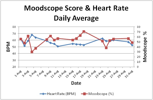
In order to compare my heart rate data with my Moodscope score I computed a daily heart rate average which you can see below. We can see that there are two negative and one positive spike in the Moodscope data, but that these are not reflected to the same extend in my heart rate changes. In the reminder of the blog I will look at some of the possibilities of why this is not the case. Especially as I often felt that Moodscope was reflecting my levels of activity, rather than my mood.
It might be interesting to consider that Moodscope is a conscious measure whereas the body blogging system is an unconscious measure. What I mean by this is that emotions are often experienced unconsciously through our psychophysiologicalphysiological systems, such as the sympathetic and parasympathetic nervous system. Emotions may therefore be experienced differently on a physiological level before they become conscious. This does not only introduce a delay in objective and subjective mood but may also change the emotion simply through the process of thinking about it. An emotion may start of as the physical experience of fear (palpitations, increase breathing etc.), but turn into excitement once it is consciously experienced.
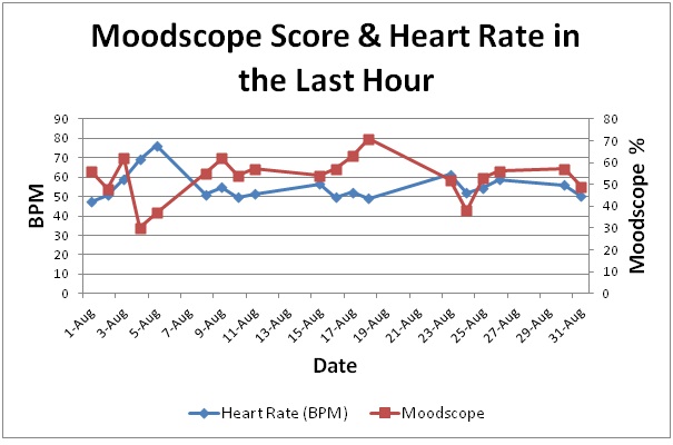
There are a number of other incompatibilities between the two tracking systems. Moodscope is a subjective measure that is being used once a day whereas the body blogging system is an arguably objective measure that takes multiple measures in a day. This means that the body blogger is reflecting a wealth of information from different times of the day which is lost when reducing the data to one daily average. The frequency of recording is particularly important in the representation and understanding of the two systems. The continuous recoding of the heart rate introduces a great deal of variation, such as a change in activity between the morning and the afternoon that is not found in Moodscope. This is reflected if we compare the graph 1 above, reflecting a daily average of my heart rate data with the graph 2 below which represents the average heart rate for the hour that I took the Moodscope score. We can see from the two graphs that the second one, graph 2 represents a greater compatibility between my Moodscope score and my heart rate recordings than graph 1 above.
Graph 2
Despite the slightly better match in graph 2, Moodscope and the body blogging system are still not completely compatible. Along with the loss of a lot of heart rate data, through the analysis of only one hour from a full days recording.
The event that appears to be most clearly reflecting something is the 4th of August where we can see a large spike in the heart rate data and a great dip in the Moodscope recording, but we need to add more meaning to this to see what happened on that day (I will return to this question later). This raises the question of context and how this context is added to the heart rate data. Two ways of doing this is top-down or, bottom-up interpretations. In top-down interpretations we predispose the outcome of the heart rate, i.e. the compatibility with Moodscope; in bottom-up interpretation context is added and build up around the data after the recording has been done. I was using a top-down approach by predisposing my Moodscope score as context for the interpretation for the body blogging data, but the graphs above show that this approach is very limiting. A better way to analyse body blogging data may be a bottom-up approach, such as used in Kiel’s longitudinal recordings that allows adding context to the heart rate after the recordings have been made.
One way of representing this data are,
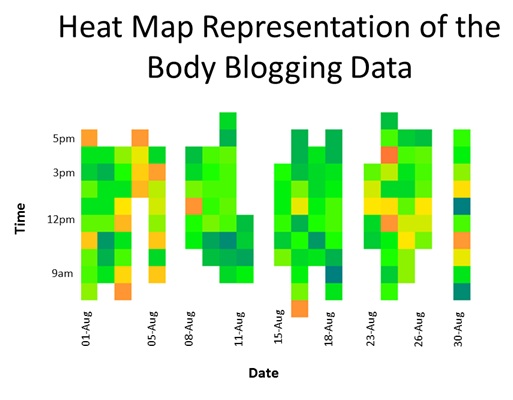
Heat maps which can become a ‘heart rate skeleton’ to which we can add meaning. Below we see a representation of my data for August as a heat map. The different colours reflect levels of activity in my heart rate. Green reflect low levels of activity, for example when sitting down and reading; yellow reflects lighter activities, such as walking around or having lunch; red reflects higher levels of activity such as high impact exercise. We can see from the heat map below that there is a great deal of variation throughout each day. This richness of experience is lost when we try to reduce the heart rate data to one daily mean score.
If we now look at the 4th of August we see from the yellow and orange colours that my heart rate was very high, as you would expect if I was out walking, exercising, or doing housework. What’s interesting is that I was asleep at the point of recording and what you see here is my body fighting with the common cold. By looking at unusual events such as this one I can add meaning to the recordings in a bottom-up fashion. This allows me, with time, instant access to these patterns as I become more able to read thesesthese patterns as Ithis one I can add meaning to the recordings in a bottom-up fascion allowing me, with time,.
Using heat maps to represent the continuous stream of body blogging data allows for a greater insight and understanding of changes within the system. Without this the data can become easily boring and tedious. Heat maps enable also a better sharing of experiences with significant others as a mere recording may be seen as meaningless without the knowledge to interpret bpm.
Overall I found that these two systems are not very compatible and that Moodscope did not add to my body blogging experience [1]. I realised that a bottom-up approach to the interpretation of the body blogging data is a lot more fruitful than a to-down approach. I found that the recordings and the sharing of these was meaningless to me as well as others if it was not processed and presented in a more accessible way. But perhaps it’s not a daily recording that we are looking for but the recording of shared experiences that are important and special to us. White-water rafting or New Zealand winning the 2011 world cup could become a new way of sharing an experience with friends, it could also be a new way of recording, and memorising ones experience as it is a trace in the past that informs us of the ups and downs of that particular day. Imagine wearing a sensor on you wedding day… you would be able to capture the butterflies that you experienced on that day in bpm
[1] It is interesting to note that Moodscope has changed its layout at the beginning of the year. You are now able, for a small charge, to access a variety of functions that allow you to analyse finer details of your mood changes by looking at individual parts, such as a separation of positive and negative affect. This also includes an ‘Affectogram’ which is a visual representation of one’s daily mood that is very similar to the heat map.


“What’s interesting is that I was asleep at the point of recording and what you see here is my body fighting with the common cold.” This is exactly the sort of thing that you’d want to know about in a real-time analysis system. Thanks for sharing this!
It seems that activity might be a leading indicator for mood — so it doesn’t seem a priori a *bad* thing that your Moodscape measurements were more indicative of activity. YMMV. 🙂
Great write up! My website, QuantiModo can import your mood data and heart rate data and calculate a predictive correlation. If you ever get a chance, try it out. I’d love to hear what you think! 😀