The problem with collecting in any amount of data is figuring out how to present that data in a manner that is meaningful for its intended audience. For example if you want to assess the physical effort you exert during a run a plot of physiological activity (e.g. heartbeat rate) against time will provide you with a relatively simple visual representation of how your body adapts to physical stress.
Time series graphs are great for drawing meaning from physiological activity that occurs over a short period of time but how do you draw meaning from long term trends in physiological activity? As we run The Body Blogger project I’ve become interested in ways I can visual a month or beyonds worth of data in order to provide a better understanding of myself and determine what changes I could make in my life for the better. To that end I’m currently experimenting with heat-maps, where I visual an entire month’s worth of data as a two-dimensional grid of coloured squares. Each cell represents a different point in time and is coloured according to the average level of physical activity that occured during the time it represents (e.g. if the average heartbeat rate between 12 and 1am is 50 bpm the cell is coloured blue, whereas if between 5pm and 6pm the average is 70bpm the cell is coloured green). In this manner I can quickly grasp how my physiology has changed over the preceding days.
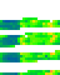
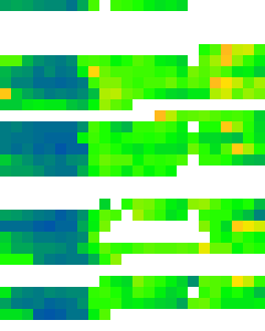
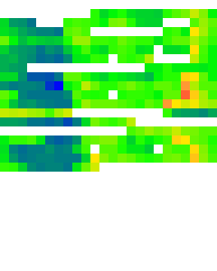
Below is a screenshot of my current visualisation routine showing heartbeat rate heat-maps for the previous three months, blue represents my sleep state, green my rest state, yellow my recovery state and red my excerise state (white indicates no data collected). The x-axis (left to right) represents time from 0:00 to 24:00 and the y-axis (top to below) represents the day of the month. While I’m still fine tuning the system (e.g. tweaking the colour scale) its been interesting to see how my day usually pans out. Just from glancing at the heat-maps I can see I don’t get nearly as much sleep as I should do (i.e. no blue or blue green interpolation in the evening) and I can easily pickout which days I went running and which I didn’t (i.e. yellow/orange in the evening).
Whether this visualisation method will allow me to extract any particularly useful meaning is debatable, but as physiological sensors become more prevelant in our lives and we all start to collect long term data we should start to explore if there’s anything more we can do beyond the defacto medical and health applications.

|
 |
 |
Figure 1 – Heart activity for the months June, July and August visualised as a heat-map.
Nice post Kiel. It seems to me that this kind of visualisation is well-suited to a ‘zoom-lens’ model where the representation of different states (colours in your example) remains fixed whilst the level of detail is scalable. For instance, I know the system works on the basis of four (?) colours at the moment, which is fine for this high-level visualisation. But we could set up subcategories for each zone/colour, e.g. four shades of green depending on where HR falls in the green zone – these subcategories would only become apparent if we looked at a heat map at higher level of resolution, such as 24 hours.
Pingback: Physiological Computing : BioS-Play 2010 Workshop Experience Report – Part 1 of 2
Pingback: Physiological Computing : Moodscope, subjective ratings and body blogging
Pingback: De la mesure de soi (1/3) : Mettre l’informatique au service du corps | InternetActu